


In today’s day and age, practically everyone walks around with a smartphone, laptop, a tablet or sometimes, even all three. Being able to communicate through social media and the Internet at every minute of the day has become a necessity. This is specially true in the fast-paced corporate world where words like SEO, social media and marketing strategies are thrown around all the time.
Making sure that your company’s website is accessible to the general public has never been more important. Now, ensuring that your content is creative, accurate and engaging is of course your first prerequisite. Next comes, search engine optimisation and targeting keywords. But all this is of no use if your website can’t be viewed perfectly on all devices. This is where responsive web design comes in.
What exactly is Responsive Web Design (RWD)?
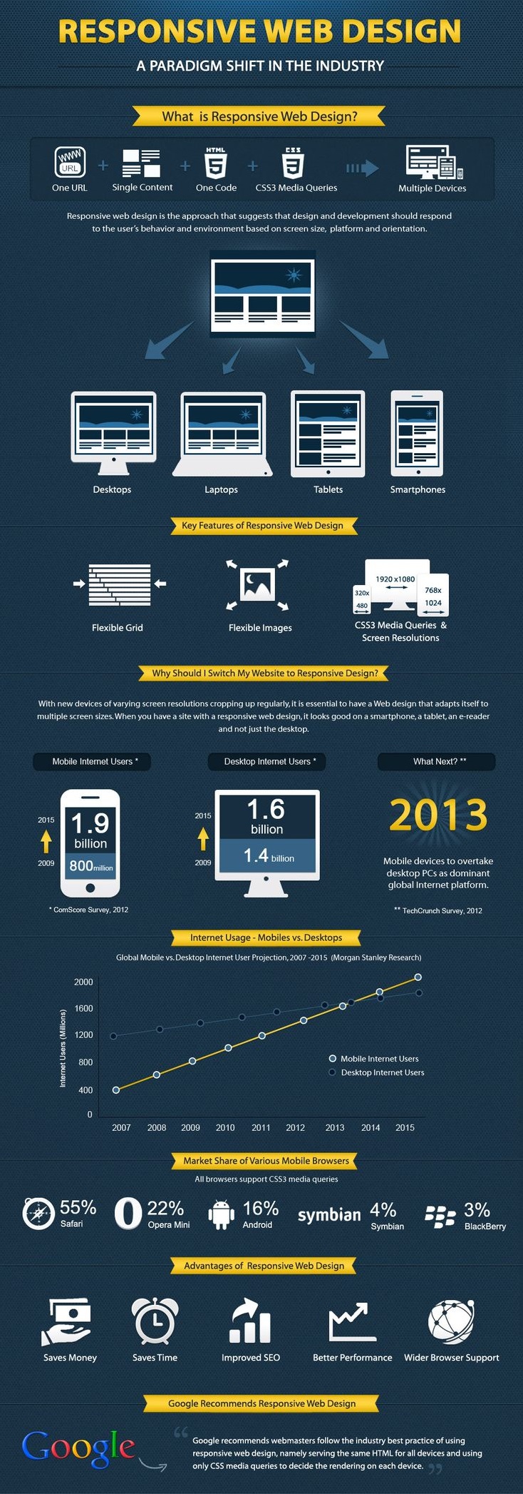
Responsive Web Design basically involves the automatic reformatting of the pages of a website depending on the particular device that they are being viewed on. This is done to make websites more user-friendly, especially if they are being viewed on mobile phones. Why is responsive web design such a popular topic of discussion today? Well, in the past, companies had to develop special versions of their official website just for mobile users and this was separate from the main website. But today, with responsive web design, viewing pages on your mobile phone has become so much faster and simpler!
Can Responsive Web Design improve your SEO ranking?
Yes, it most certainly can! Today, Responsive Web Design is making huge waves in the world of Search Engine Optimisation.
Google Rates Responsiveness Very Highly
Today, the best way to target mobile-using potential customers is to make use of responsive web design. It is highly recommended by Google and when any searches are made through mobile phones, Google favours mobile friendly sites and gives them a higher ranking. It does this specially for users who are searching for local businesses.
Single Responsive Website v/s Separate Mobile Website
The jury is still out on whether having a responsive site or a separate site for mobile users is better. If you consider it from an SEO perspective, a single website for all devices is the best bet because it uses just one URL and one particular set of pages which makes indexing content simpler for Google.
However, if your website has a lot of content, scrolling down continuously can become a major problem for users and will detract from the user-friendliness of your website. Mobile sites which are specially designed with the aim of making viewing easier for mobile users have the advantage in this particular situation.
If you have a separate mobile site, building authority can become a problem because you will have to start from scratch. However, a responsive website allows you to focus all your SEO efforts in one place and will thus, make them more effective.
Combat Your Bounce Rate with Responsiveness
Although specially designed mobile websites are more user-friendly when it comes to mobile phone users, they often suffer from a high bounce rate if Google feels that the content the sites are displaying is completely different from what can be seen on the regular site, and if it is too stripped down. This could lead to a major drop in rankings and visitor footfalls.
Enhance User Experience
Google embraces sites which make use of responsive web design because these sites are more user-friendly. Making sure your website is responsive and can be viewed easily on all devices and not just your desktop is the best way to guarantee that your target audience enjoys a positive experience!


